Friday, 4 December 2009
Skate ghost
We decided to animate a skateboard going along the ground, doing flips and grinds like you would see in a skate video. Though we tried to make the tricks look somewhat realistic, we also wanted to take advantage of the fact that we could make it do anything. And that is why the skateboard is suddenly going along the wall and stuff like that.
I think we could have probably gone even further and done more "fantasy tricks", but once we had all the once we envisioned from listening to the soundtrack, we just left it at that. And we are happy with the variety of tricks.
The technique was clear from the beginning: to animate the board one frame at a time, with someone holding the board in position, and then in post key that person out. This sounds way easier than it is. Keying is a complex tedious process. With most of the clips, we would have been better off reshooting them, but we already worked a lot on them.
Things like fingers on the board and shadows especially, is something you know to keep aware of whilst shooting, but it is, like i sais, easier said than done.
We both agree that the end result meets our expectations, but it would be fun to get it even better.
The timing of the animation and things to be aware of while shooting, are the key elements of this project. And we feel we could have done that better. But all in all we are happy with the experience of the animating as well as the post production we did.
It makes us laugh and we had fun!
Sunday, 18 October 2009
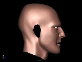
My face!
 This is the first render. I was mainly working on this side. I think it's not looking too bad the nose especially.
That is the reference picture I was working from.
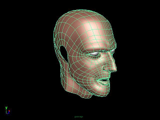
 Since face topology is such an issue I thought I might just render out the mesh grid. I think I've done it right. I avoided triangles and hid 5 star vertices by the cheek and the nose. I hope that it's all right cause the only way to find out is to actually animate it and see how the mesh behaves.
1st weeks!
Friday, 29 May 2009
The final project! Cause all of the group members apart from me and Leah come different towns we had a massive problem with communication. It hardly ever happened that we were all in at once for a group meeting or so. The actual outcome is not like we really wanted it to look. The initial idea got lost somewhere along the way. If i could do it again, I'd do more tests beforehand to see what the end result is gonna look like. There was to much talking about the looks at the start, but I'm pretty sure nobody really knew what to do! Then there should have been more consistency with the lighting. I did two rooms and both Simon's did some others. When I then color corrected it in After Effects the rooms had different lighting in different positions even though it's supposed to be one room.
I think Jess needed more help with the 2D stuff as she did it all on her own apart from a tiny bit which he had to do again anyway. But the person suppose to help her was not really interested in doing so. I guess for the next project I'll try to avoid working with people who don't do their work.
Wednesday, 18 March 2009
Ident
To the actual Ident. I think it looks good. It looks exactly like i wanted it to look and like i said it's going to look when i pitch the idea. It's quite simple but effective. The first version had much more effects in it but after watching it a day later it looked wrong and all the effects which are supposed to make it look better turned out be rather distracting. So i took all the effects that took the focus away from statements, like animated backgrounds and more silly particle movements, and binned them. The result is more to the point and proves the old (GERMAN!!!) phrase: "less is more" right!
Monday, 9 March 2009
Live at 5!
Wednesday, 4 March 2009
Background Designs and 3D Environment

To be honest I will never enjoy modelling in 3D. It's just to tedious and fiddly. It took me hours to create the simplest shapes. I gave my best and I think the result is not too bad. It is a bit too dark, I could have used more "darker" lights to make more things visible. The proportion is slightly off. The sink and the tools are too big compared to the "torture rack", which should be big enough for an entire human body. Apart from this I think it's a good attempt.

The 2D interior design was supposed to be a proper cartoon background with some wonky shapes rather than clean neat lines. I think the shadows and lights are working quite well. I worked all of the stages from sketches to finish digital. I used my new graphic A4 tablet and a program called "Sketchbook Pro"to all elements and transferred this file to "Photoshop" for the clean-up and coloring part.

The exterior background was inspired by a picture I found on the Internet (unfortunately I can't remember where I found it) and it's supposed to have a post-apocalypse-new-dawn kind of feeling with dead creepy trees, destroyed houses,a polluted sky, but a lot of morning sun.
I like the colours and the field of depth blur. I've drawn 6 layers and blurred each individually. I worked the same way as in the interior design. Sketched it in Sketchbook Pro and coloured it in Photoshop.
As I said in the beginning of this post I have never been a big fan of background designs, but this project was actually fun and I enjoyed drawing those pictures. I learned a lot about using shadows and lights and how colours determine the mood of a scene.
Wednesday, 25 February 2009
Unfortunately I broke my wrist the week we started on walk cycles, so I didn't do the "first steps"(pun intended). I've got the main project.
The brief was to reproduce a character walk we've recorded earlier on that week.
That's my "struggled limp" 2D attempt. I think it's not too bad. The rough lines are because of the cast I had to wear, which made drawing pretty hard, but I managed. Andy said that the animation of the feet is confusing. I don't see that. I did the 3D one first and kind of copied the posture and the position of the feet onto the 2D project, so if there's no problem with the 3D one there shouldn't be with the 2D one either. Anyway I think the timing is quite good. You can see the weight of the left leg when it touches the ground, as that is the "working" feet, that is doing all the work. Plus the body is doing a nice movement he leans back to pull the "dead" leg forwards. I think it turned out pretty good, considering the circumstances!
It's almost the same with the 3D animation. I think the bodies moves even better here as you can see better how it tries to pull the "dead" leg. The feet are working pretty good as well. It looks like it's a bit faster maybe it needed a bit of a hold before or after one cycle is complete.
Wednesday, 28 January 2009
All at once!!!
I personally think the first term was slightly boring as we were not really challenged enough. Only now after the Christmas break it starts to pick up and the result is more enthusiasm and concentration.
The first big project for the History and Theory part was the presentation of an animated film. I choose "Fritz the Cat" by Ralph Bakshi as that movie fascinates me since I'm a little boy. My love for that movie was probably both a blessing and curse for me as I can literally talk for hours about it. Problem is though we just had 10 minutes and I tried to talk about as much issues as possible in that short amount of time. It didn't quite work and so the mark of 58% is deserved but slightly disappointing for me. I should have left some of the less important points out and talked more about the main issues. I guess sometimes less can be more!
Now to the animation part.
The jumping man
It works quite alright! Timing is a bit to fast especially at the middle part where he's in the air. The anticipation is quite good but for an actual jump it's not believable. The body should squeeze downwards instead of backwards. It also needs more squash at the end to give the body more weight plus a little bit of a hold to make get the timing right.
3D bouncing ball
I can't quite put my finger on it, but something went terribly wrong there! It just looks mechanic or like the ball got his own mind. It just doesn't bounces like a normal ball and that was the task. I believe the beginning is wrong. The angle of the first bounce is to tight the ball would bounce almost straight up instead of sideways. When the ball comes up again it needs to ease out more to make the timing right. The other bounces look alright but the halt of the ball at the end comes to sudden. Could've bounced a bit more.
3D Jumping Man
I am actually quite proud of this! The timing is good. The anticipation could be a tiny bit more exagerated. There could have been a bit more of a squash when he lands plus the hold is too static. The hands work fine and the stretch is alright! But in total a good attempt!
2 Character animation
Ok, I'm not sure whethere I got the task right! The brief was to animate 2 charcters the small one is annoying the big one would tell the other one off. There was supposed to be a lot of anticipation and big gestures. Nothing's really happening here! You can clearly see what I wanted to say and the animation (the little that is there) works, but there's not enough movement. So you don't feel really sorry for the small character and that was the main goal to achieve. I guess I'll have to listen closer to what they're saying.
