For the Advanced Masterclass we have to model our own faces. Even though it's not an assignment it still takes up a lot of my time. I've never really liked modelling but after all these hour I spent on making the head so far I'm starting to see the fun part of it.
The weirdest thing is that I really closely looked at my face- probably for the first time in my life(!)- and I discovered some strange things that I've never really noticed before. I haven't got a very distinctive cheekbone. My face generally is quite smooth (I wouldn't have said that before)My eyebrow bone isn't really standing out either. There's a lot of funny stuff to find if you look closely.
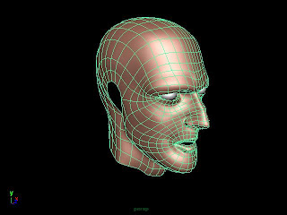
I haven't heard of the term topology before but apparently it has a massive impact on the animation process. So I tried pretty hard to keep that in mind while I was modelling.
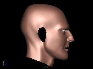
 This is the first render. I was mainly working on this side. I think it's not looking too bad the nose especially.
My eyebrow bone isn't as distinctive as I modelled it so I guess I'll have to flatten it a bit and maybe move it up cause I'm looking kind of angry right now.
The mouth need a bit more tweaking but I'm almost there.
The shape of the head looks quite good especially the bulgy bit at the back.
My jaw is probably too sharp and needs a bit of smoothing.
That is the reference picture I was working from.
 Since face topology is such an issue I thought I might just render out the mesh grid. I think I've done it right. I avoided triangles and hid 5 star vertices by the cheek and the nose. I hope that it's all right cause the only way to find out is to actually animate it and see how the mesh behaves.
The next step will be transferring this mesh into either zBrush or Mudbox to add more details to it. Then texturing!
